Case Studies
Experience Strategy
Cargill
My Role: UX Research, Content Strategy, Interaction Design, Prototyping
Deliverables: Content Audit, Site Architecture, High Fidelity Mock ups, Communication Strategy
Background
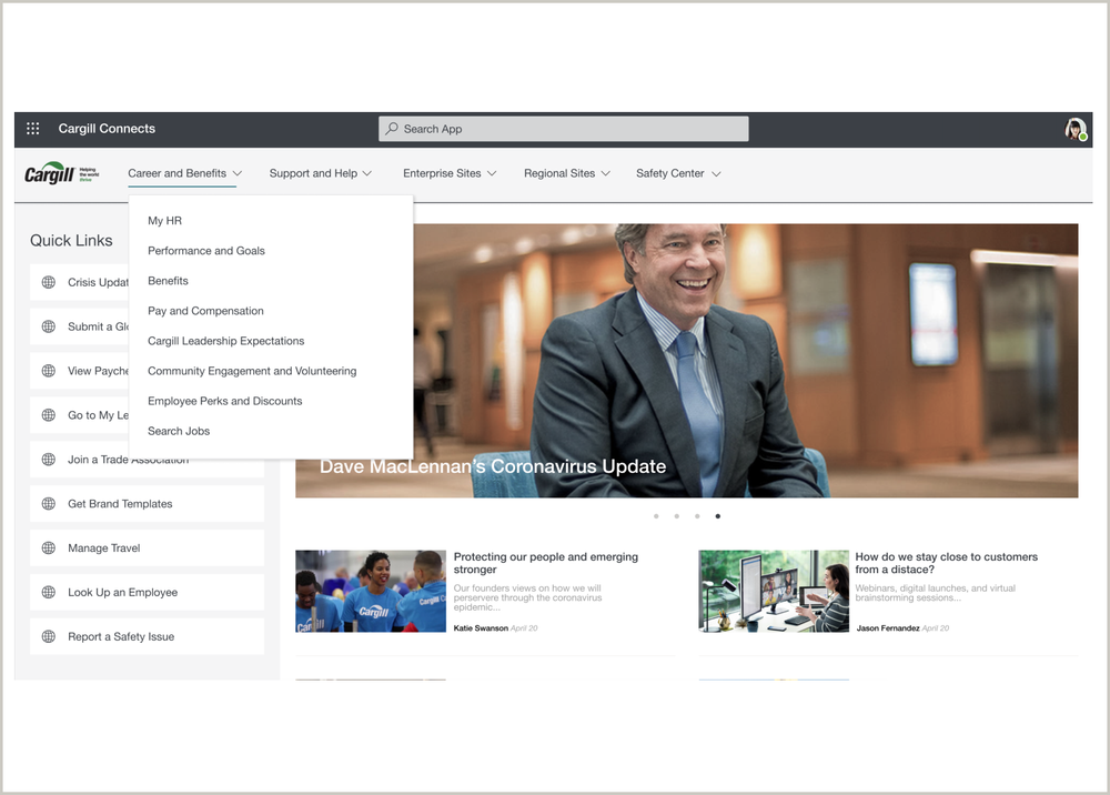
Cargill is a global food corporation in the agriculture logistics and processing space. As nearly their entire workforce shifted to remote work during the COVID19 pandemic, it became clear their former custom built internal intranet system was outdated and many important communications were not received by staff. Cargill brought in Slalom to help them establish a communications strategy that takes inventory and defines the purposes of content and applications within the Cargill Connects ecosystem.
What We Did
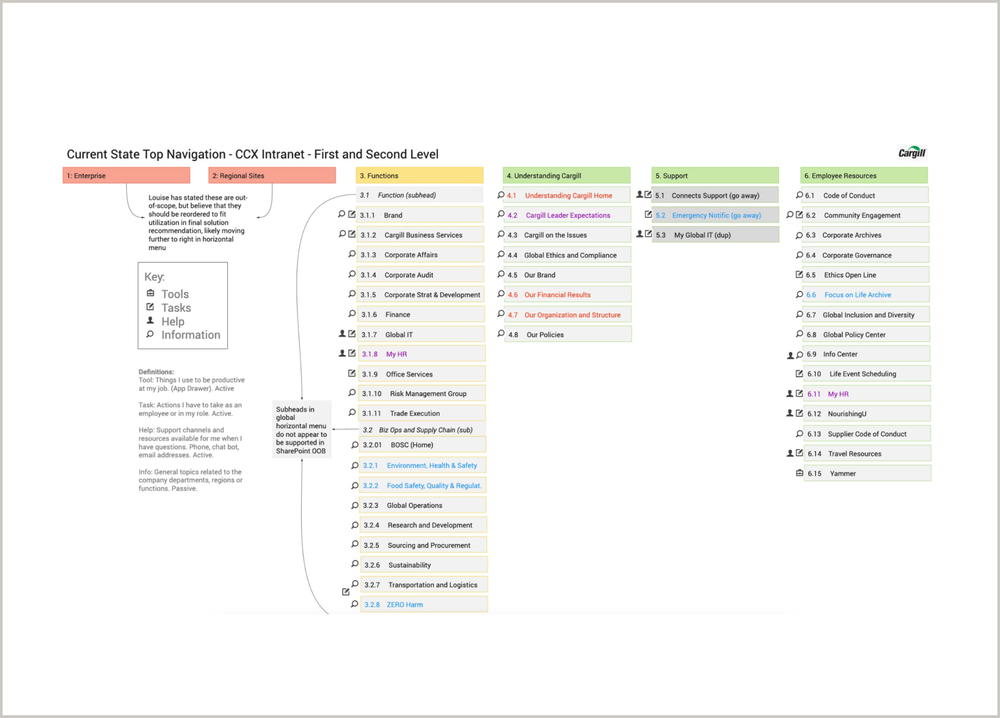
My colleague, Kim, and I collaborated with the Cargill Digital Transformation team to re-architect and design a new intranet. We began by auditing the existing site including detailed site mapping, content audit, evaluation of branding and key messages, select function and enterprise sites, paired with 1:1 stakeholder interviews to understand top priorities and goals. We then analyzed the information architecture, usage analytics and taxonomy to understand how the site was used and by whom.
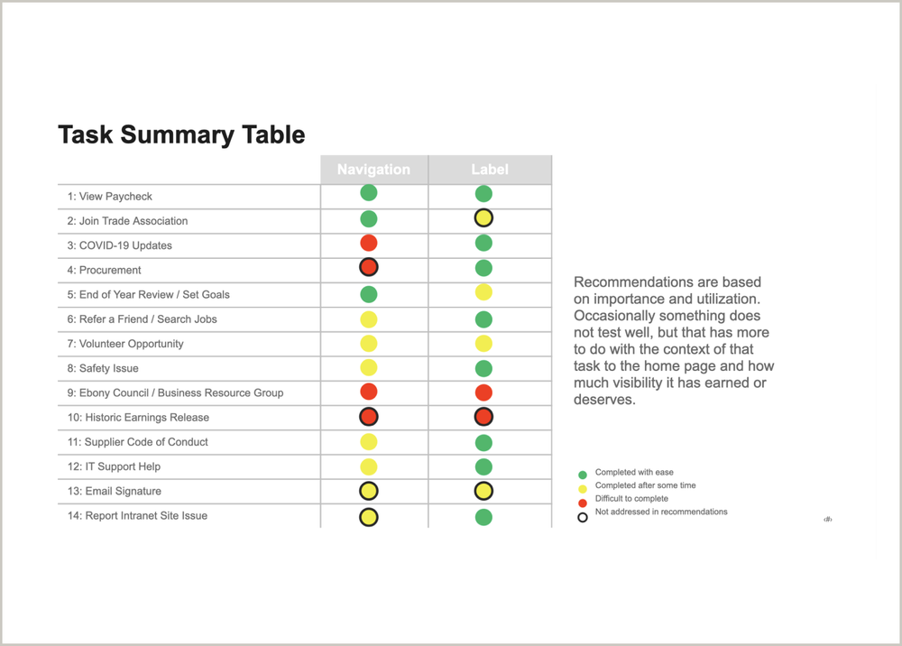
Together, we re-architected and tested the site navigation, removed outdated or under utilized content, streamlined language and taxonomy and mocked up a new site using Microsoft HomeSites; an easy to use CMS that would allow non-technical Cargill leaders to easily update content over time. After completing task-based UAT to assess findability of specific key content as well as general understanding of the new labels and language we delivered high fidelity homepage designs, site navigation, communication strategy and materials for socializing with appropriate business owners.
Outcomes and Impact
Our solution streamlined the Cargill disseminated information to their global workforce, created infrastructure and governance for business owners to create and share content in the future, and made the most important communications and company information easy to find.
What I Learned
Cargill was the first project that I worked on that touched global users across several different job functions and entry points to the platform we were re-designing. For that reason, I collaborated with stakeholders from each continent to better understand the unique needs of the employees they supported in their region and function. Key learnings:
Designing for Global Users; how to align and prioritize differing user needs (culturally, per function, and access to technology) in a way that makes everyone feel seen and supported and achieved business goals.
Content Strategy; this was my first opportunity to get hands on with content audits and building a comprehensive, inclusive, strategy for implementation.
Thomson Reuters
My Role: UX Research, Process Mapping and Design, Strategy
Deliverables: Journey & Process Maps, User Research Insights, Onboarding Strategy, Change Management Plan, Pendo Guide Mockups and Strategy
Background
Thomson Reuters has an incredible reputation for their tax, accounting and law software as they are committed to continuously improving their products and services. However, as they continued to make great improvements to their tax and accounting software, the updates to their onboarding process did not keep up. They had decided to take a white glove, hands on, approach that had grown to span multiple teams and was becoming unsustainable for both customers and employees. Thomson Reuters brought in Slalom to redesign an onboarding process that required less hand holding, was more efficient, and built confidence with customers out of the gate.
What We Did
My colleague, Kim [change management lead] worked together to outline the current state experience from pre-sale through the first six months of use for both new and existing users.
I dove into user research, documenting the current state in a master process map, including emotive mapping, customer and staff quotes and presented to our stakeholders for buy-in and feedback. We found the current state onboarding experience was using a hands on approach for a capability and feature overview [which could more easily be done via a digital onboarding tool such as Pendo] and had customers migrate their resources via an extremely time consuming manual self serve process.
Once we received the green light for a re-design, we designed a new onboarding process complete with hand-off points, new roles and responsibilities of onboarding support staff and change management plans, as well as mock-ups of Pendo guides to include all language, steps and an implementation plan.
Outcomes and Impact
Our solution improved the onboarding experience for TR’s tax and accounting software for customers and created more clear roles, responsibilities, handoff and interaction strategies for their onboarding staff. We also helped to improve the way their internal design team tackled challenges in other work streams by providing a repeatable human centered framework and supporting templates and resources.
What I Learned
Our project kicked off at a turbulent time for TR internal technology team with re-orgs, changing of titles and responsibilities which created some friction between us as external consultants and their internal team members.
Cross-Team Collaboration; it was imperative for Kim and I to build trust quickly, show genuine respect for their current solution and co-create a solution that everyone touched and was proud of.
Agility; change orders continually came down the pipe as we moved through this project. I had to learn to find comfort in the chaos by continuously circling back to and sharing out our objectives and measures of success.
Virgin Voyages
My Role: UX Research, Customer Strategy, Workshop Facilitation, Product Strategy
Deliverables: Competitive and Analogous Research Insights, Qualitative interview insights, Site Map and Content Proposal, OKRs, Product Strategy
Background
Virgin is known for its kitchy brand and exceptional and funky experiences. It was exciting to hear of their newest venture, Virgin Voyages, an adult only luxury cruise line. In early 2019, Virgin Voyages set sail to create an innovative, intimate and luxurious cruising experience. However, just as they finished their first sailing they had to press pause for COVID. This pause created an opportunity for Virgin to invest time and energy into their online presence, redesigning how they tell the world what makes their experience exceptionally unique. They brought in Slalom to do a deep dive into their target audience, site architecture, and how they might balance their unique traits with sharing relevant information important to prospective customers as they explore different vacation options.
What We Did
I worked in a team of three including an experience designer and product strategist to do a deep dive into cruising, focusing on the awareness and consideration phases of the booking experience. We completed a thorough competitive analysis and created a library of analogous and inspirational research to draw from as we began solutioning.
We spoke with dozens of prospective vacationers to better understand where they sought out vacation inspiration, how they tackled the planning process, how they chose their destination or vacation type, and what they loved about cruising. We also facilitated multi-day OKR workshops to help stakeholders align on top priorities and to identify key customer-centric metrics to act as our measures of success.
Outcomes and Impact
We delivered a robust set of insights from both our market research and our qualitative interviews and paired those with suggestions for improvement to their marketing website site map and suggestions around content and language [as we found not everyone understood what a ‘bevvy’ was]. We also delivered an implementation plan that aligned to the previously outlined OKRs and a product strategy roadmap for next steps.
What I Learned
I partnered with two senior leaders on this project, both at 25% capacity. I was thrilled at the opportunity to work with two senior leaders who I deeply respected, however, the reality of working with two leaders at 25% capacity wasn’t what it lived up to be. I struggled to find my footing at first as I was looking to my leaders to, well, lead - but 25% capacity means your attention is 75% elsewhere.
Leading My Leaders; I found my voice in a balance of getting everyone up to speed quickly, sharing my process, my deliverables, and plans for next steps and making sure my leaders felt like they were a part of the process, weaving their thoughts and ideas into our work, and making our clients feel like they had three dedicated resources.
Vulnerability; I struggled with the format one of my teammates provided feedback. They were unable to set clear expectations and were quick to share when they felt my deliverables didn’t meet their mark, but often weren’t able to provide actionable feedback. It felt like swirl and began to burn me out. My people leader encouraged me to vulnerable, and regardless of the outcome, I was glad I found the courage to share my truth.


