
UX Design & Prototyping
Stride 360
Services
User Research
IxD
Wireframes
Branding
Interactive Prototyping
Usability Testing
Marketing Website Design
Deliverables
Personas
Brand Concepts
Wireframes
User-interface designs
High-fidelity prototype
Marketing Website
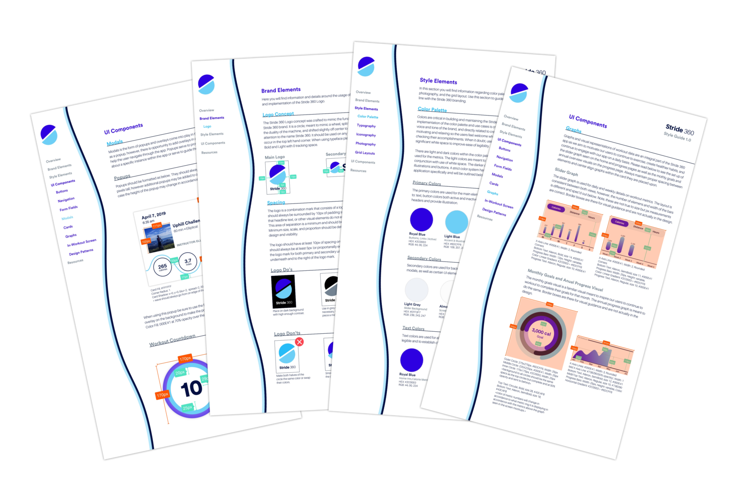
Style Guide & UI Kit
Outcomes
Working directly with the founder, Joseph, I delivered a polished prototype which was used to demo to investors for startup funding.
Thanks to close collaboration with the founder, the prototype, and marketing collateral, the client was able to launch a dynamic at home fitness machine made stronger by a community-based app.
Background
Stride 360 is a home fitness experience made up of a fitness machine paired with a digital remote and tracking tool. The exercise machine is both a stationary bike and an elliptical in one machine that uses a digital application to control the bikes resistance and track metrics like distance, time and calorie burn. The interface also allows users to track their workout progress over time promoting consistent workout habits to improve overall health and happiness.
“We sell happiness/Health Journey.” -Joseph Founder & CEO
Joseph saw Stride 360 as more than just a fitness machine, but as a conduit for changing behavior towards creating healthier habits to lead a happier life. I used this quote as a reminder to explore the limits of my designs to not only be functional but also emotionally connect with our users.
Problem
Fitness communities are typically location-centric, making it challenging for those living in suburban or remote areas to stay motivated in their fitness goals.
Solution
A comprehensive and diverse at-home fitness platform with community accountability.
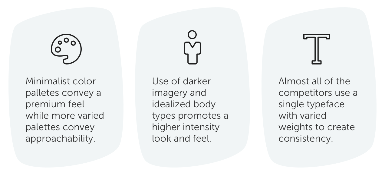
Competitive Analysis
I examined both direct and indirect competitors such as; Strava, Peloton, Nike, etc. as well as a few out of category companies to evaluate the market trends and patterns. Then, I affinity mapped and synthesized our research to determine their strengths and shortcomings.
Target User
I determined our primary user was the suburban mom; concerned about her health and therefore incorporates fitness into her daily routine. She has the means to purchase a moderately priced at home fitness machine, and holds the household buying power.
Frustration
“There is no fitness app that caters to her needs. They’re all high intensity and for young people.”
Motivation
“I want to stay healthy so I can run around with my grandkids one day and maintain my figure.”
Goal
“I want to do workouts with motivating coaches, and be more consistent with my workout routine.”
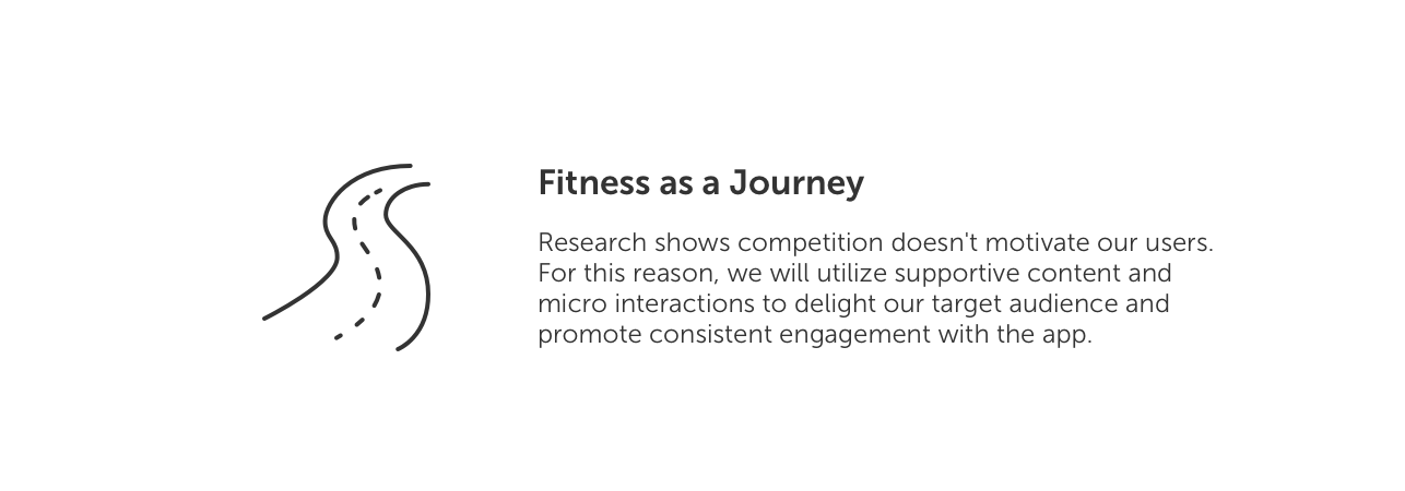
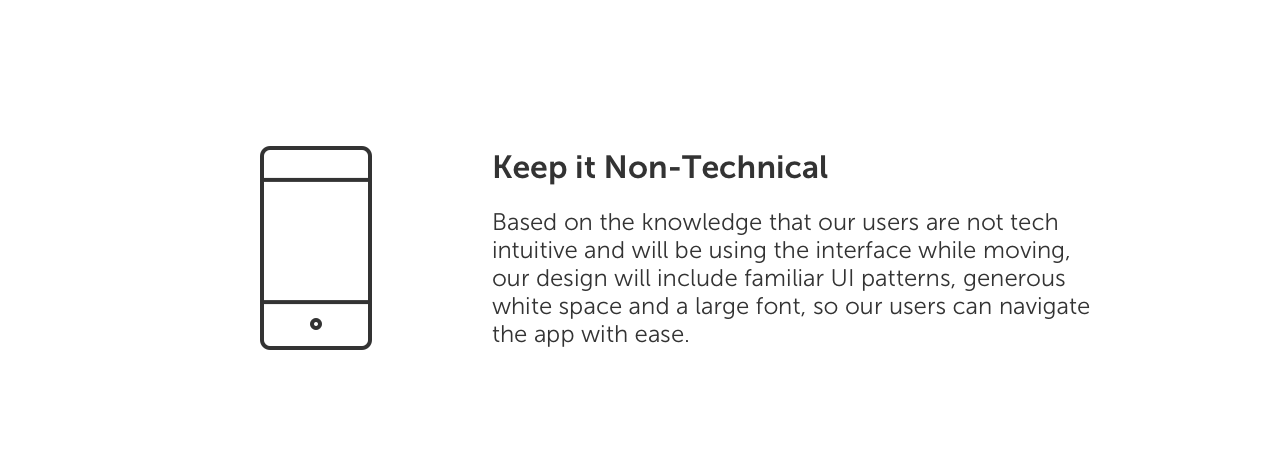
Design Principles
We aligned on a few core concepts that reflected the needs of our niche user-base. Knowing our target user is not tech savvy I wanted to better understand the elements and patterns that resonated with them so I could create something familiar and easy to use.
Wireframes
I wanted to take the foundation of what the former team did well, and expand on it in a way that incorporated the idea of consistency and making progress and engage with our users in a way that makes them feel like they are working with Stride 360 to achieve their goals.
The app needed to function as a remote for the machine and promote consistent exercise habits with community accountability.
Brand
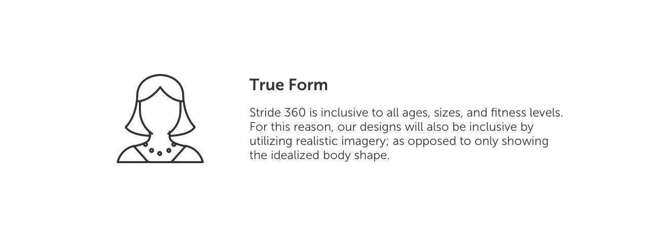
The machine is intended to be used by anyone in the home. I talked with my family and friends about how exercise fits into their lives and what mood it sets for them. I created three divergent concepts that might define the Stride 360 brand to test with users.
I thought about breaking outside of gender-specific visuals to be more inclusive and pushed the boundaries to include more inclusive visuals consistent with our target market.
The rigor of a flywheel class with an edgy laid back vibe.
I wanted this one to feel like you were walking into a dark cycling studio, gearing up for an intense spin class by using bright gradients and an edgy font to create a feeling of enthusiasm without the stark intensity.
Free Form.
Thinking about our diverse audience, the goal here was upbeat, light, and energizing. Organic shapes paired with waves and bright neon colors give this concept excitement and movement without the adrenaline rush.
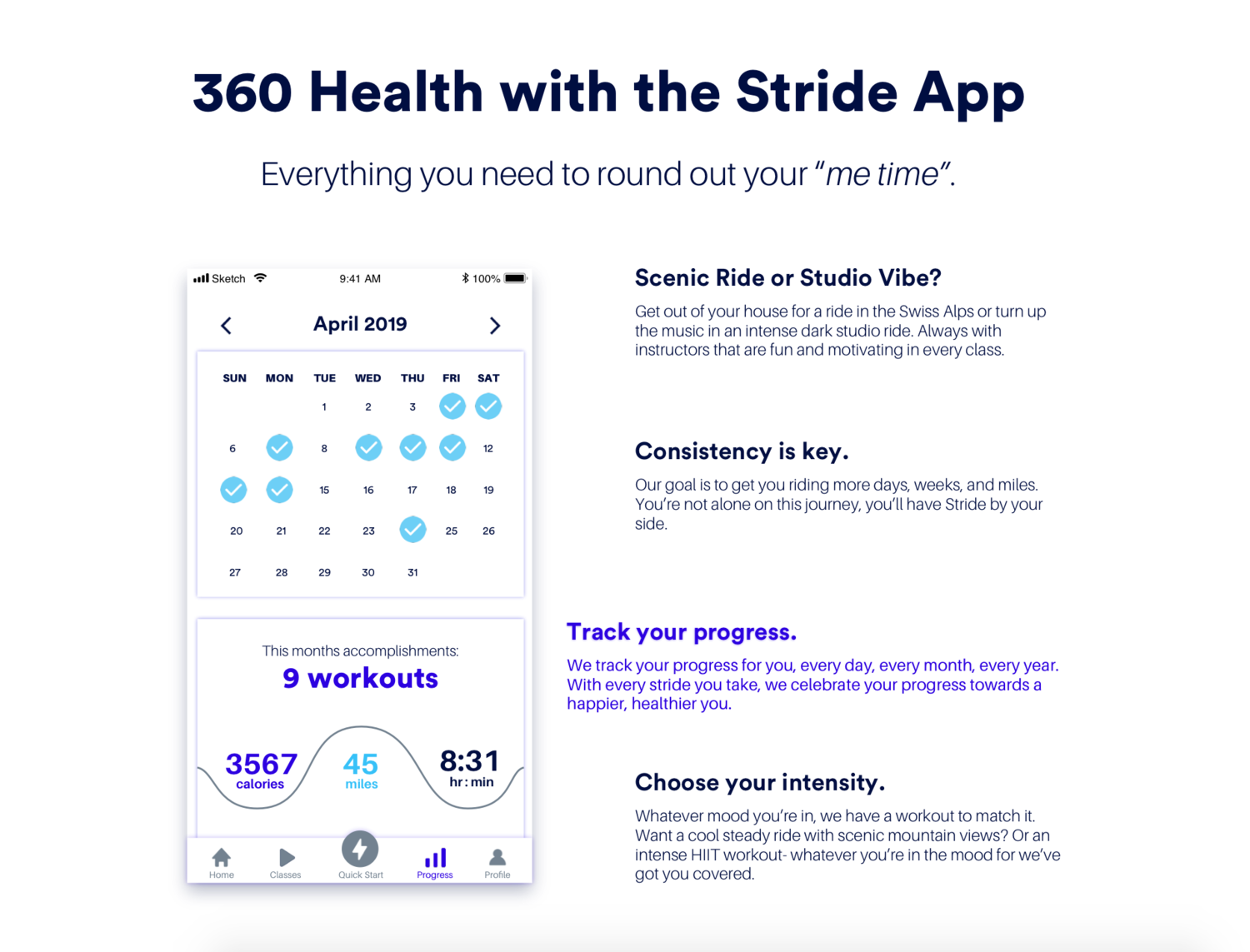
Everything I need to round out my “me time”.
The idea of using exercise as a way to escape their day to day routine and revitalize themselves came up several times in the user interviews. Generous white space gives this concept a fresh look with lots of space to move around, a cool blue color palette, and casual language for an inviting and bubbly experience.
Prototype & User Feedback
Home
Users were very receptive to the card layout. They felt clear on how the information was separated into segments and reported the headers were clear and easy to understand.
Users were excited to see their progress laid out in this graph and were clear on how to switch views. Some users reported they would like to be able to set which metrics are shown first if calories burned doesn’t hold as much meaning for their goals.
The bottom navigation labels were clear and inline with what users expected to see in the app and on each screen. Some confusion did arise around the quick start button, specifically what would happen if users clicked on it. I solved for this problem in the final prototype by added an intermediary screen where they could set which machine they were on and how long they want to workout.
Classes
Users loved the color system I deployed which is clearly seen on this page. They knew that anything in grey was a button and once it was clicked they expected it to turn royal blue, consistent with the bottom navigation.
Users also liked the flexibility of being able to search for specific classes or instructors as well as browse by different categories such as by workout duration or intensity.
Additional testing should be done on the filter categories to ensure they were clear and meaningful to users.
Progress
After the first round of user testing I got feedback that they would prefer to set monthly goals and view their progress visually as they completed them. I decided to use a circle visual graph.
Consistent with the home screen feedback, users liked the ability to get granular with their workouts and view their exact stats from each week.
The calendar popup tested really well with our users. They were hesitant at first to click the check marks because they were not grey, which is something that should be explored in the next iterations and testing rounds.
Profile
Originally called “Accessibility” users preferred the word “display” when talking about accessibility settings. Also due to user feedback, I added a “metric preference” to this section so users who prefer to see their milage over calories first can control that here.
Users liked the ability to set preferences for viewing specific workouts only, especially in homes where husbands and adult children might be using the machine and might only be interested in the bike or high intensity functions.
I was not able to test the slider bars or the upper limits of the monthly goals. Both of those would need to be further explored for usability and desirability for future consideration.
In-Ride
Users liked that the in-workout screen was clean and that most of the screen real estate was spent on the intended class content.
Users really enjoyed the progress bar so they could track how far they had gone and how much time was left in their workout.
Although the resistance buttons were large enough to hit by best practices (80x80px) additional testing should be done while users are actually on the machine to ensure they are large enough to make adjustments throughout the workout.
Marketing Assets
Marketing Website
Next Steps
When our 6 week engagement came to a close I haded off the competitive and user research, high fidelity prototypes, marketing collateral, and comprehensive style guide to the company. I look forward to seeing where he takes the company from here!
What I Learned
Teamwork is rewarding
I was grateful for the opportunity to work in a team alongside other designers. We did research together, and present to our client as a unified front- even though we all had different/competing brand ideas. Working alongside a team helped me lean into my strengths and harness my creativity in my own way versus comparing my ideas to others.
Empathize with your Stakeholder
Immediately after meeting Joseph I was reminded what it felt like to be in his shoes. My entrepreneurial experience is a profound asset in my design process. I was able to empathize with Joseph, and lead the conversation in a way that spoke to both user needs and the needs of the business.
Users Tell All.
It was challenging at times for me to step outside of what I thought was best and really read between the lines of what our users are saying they need. It reminded me of my time in the clinic, talking with my patients about the sound quality of their hearing aids. None of my patients had the language to tell me that they were experiencing the occlusion effect, they just said “my voice just doesn’t sound natural”. It’s our job to figure out what their “natural” was and find a solution that met their needs. There is opportunity in what is not explicitly said that you can glean between the lines.